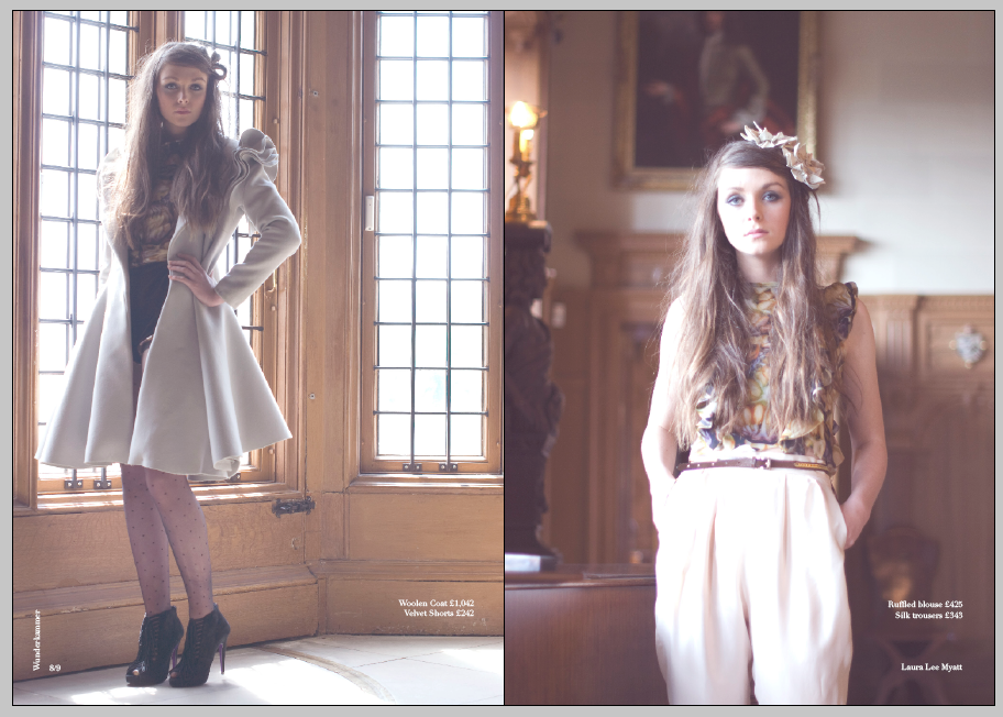
Here a few different layouts I have considered for the inside pages of the book where I have focused on the layout of imagery, hierarchy of type, using the W which I have used for the introduction page as an overlay on the imagery and also considered where the clients branding would go on the page. I think the W overlaying the type takes the quality of the image away and it also becomes a distraction, which is what I don't want when the main purpose of the look book is to concentrate on the garments and how they are presented.


No comments:
Post a Comment